Financial Education Microsite UX Case Study
Summary
Design an on-brand, human-focused financial education website to house a library of articles for a top 5 commercial bank in the United States. In 2022, the company reached more than 1.5 million people with important financial education training.
Problem
The current financial education section of the site receives considerable organic traffic. The digital & marketing leaders would like:
• The entire section to be re-imagined, with a new design proposed
• Allow the site to stand out from competitors by developing an on-brand unique visual identity
• Provide a quality user-experience that converts visitors into customers
Proposed Solutions
• Create an on-brand, user-friendly website, with clear call to actions.
• Re-brand into a microsite with unique url, separate from main site but with the ability for users to easily return. The microsite would have a unique navigation based on article organization and a consistent name that resonates with users.
• Utilize an article search feature to guide users to their intended destination.
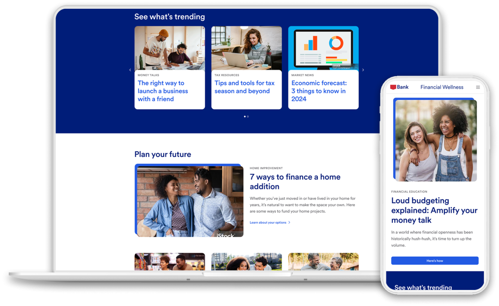
• Highlight top article in hero banner and a carousel of trending articles utilizing back-end, high-conversion metrics that auto populate space.
• Organize articles by navigation topics below the fold on home page with a CTA button to view all articles in that section.
• Employ vibrant lifestyle images, focused on engaging diverse people while also using brand illustrations to create variation and interest.
My role
Research: In-depth research and discovery of 11 different companies to compare how they are organizing their article pages, which types of components they are using, how they are using search with their articles, and the various design styles.
Sketching: To start the process of designing the site, I sketched out a search feature that a user could use to locate articles of interest. The search would feature clear topics and sub-topics while also allowing the user to filter based on tags.
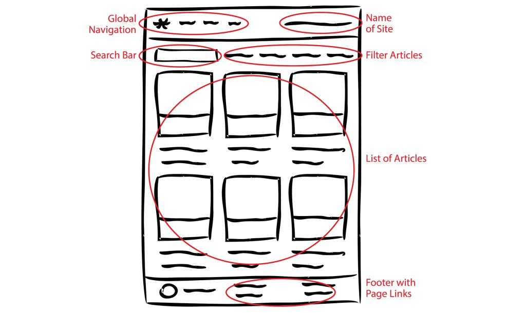
Wireframes: Using Figma, I started the process of creating a new article component that could achieve various layouts to highlight one or two articles with 3+ supporting articles. It also featured a clear CTA that would take the user to a search page of all articles for that section. I user-tested this with my manager and iterated on it using their feedback. We also discussed the back-end possibilities for components to auto-populate based on defined conversion metrics.
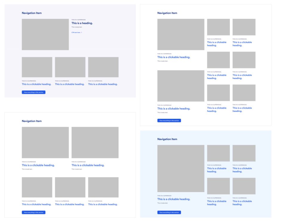
High-fidelity Mockup: The homepage design focused on highlighting brand colors, along with visually interesting images and illustrations. It also featured a component enhancement that would allow for article titles to be clickable links to reduce the number of similar CTAs on page. It utilized its own navigation and unique name, while still allowing the user to return to main website.
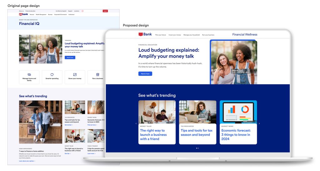
Presentation: During a meeting with the marketing manager and lead content strategist for the site section I presented my findings. We discussed the proposed solutions, and I showcased the high-fidelity homepage design. I also a previewed a page I created in our CMS using current components, to show how the page could achieve an updated look without any dev enhancements.
The Next Steps
• Recommended user research for site name along with UX testing of new CMS components and enhancements.
• Organization of articles by relevant topics with high-conversation rates.
• Connect with a dev team to determine what is possible for back-end search enhancements.
• Unfortunately, the project was put on hold after a company re-org and site section was moved into a different business line. I provided the team with my research and designs in the event they decide to restart the project.