Cookie Cart Wireframes
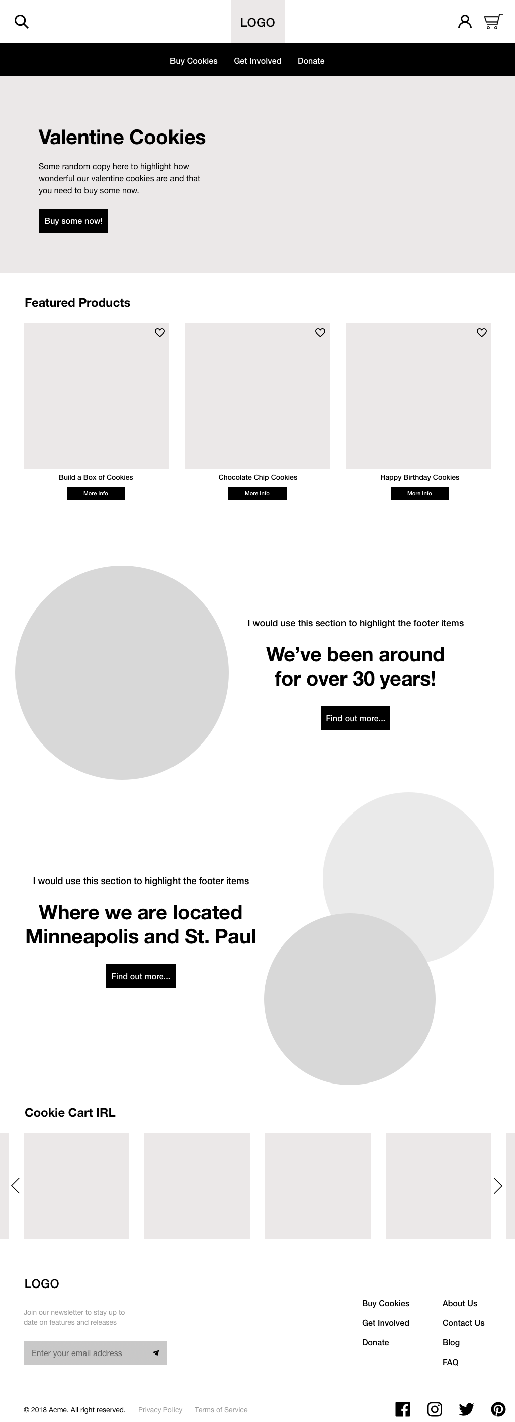
Homepage
I kept the homepage clean and simple to avoid overwhelming users on first page they see. To allow users to easily locate and find products I included a global navigation. The featured product section was key to showcasing the cookie inventory as well giving users helpful suggestions on what to buy. I wanted to emphasize the importance of the customer brand relationship by highlighting the rich history and mission of Cookie Cart. I incorporated this by featuring an “Our story” section on the homepage that also links to the About Page with further information. I also wanted to highlight their two bakery locations, so local buyers could buy in-person if they desired. In the footer, I placed important links where users could obtain additional information they might need. I also included a social feed for users to gain inspiration from other customers and to raise awareness for in-store events.
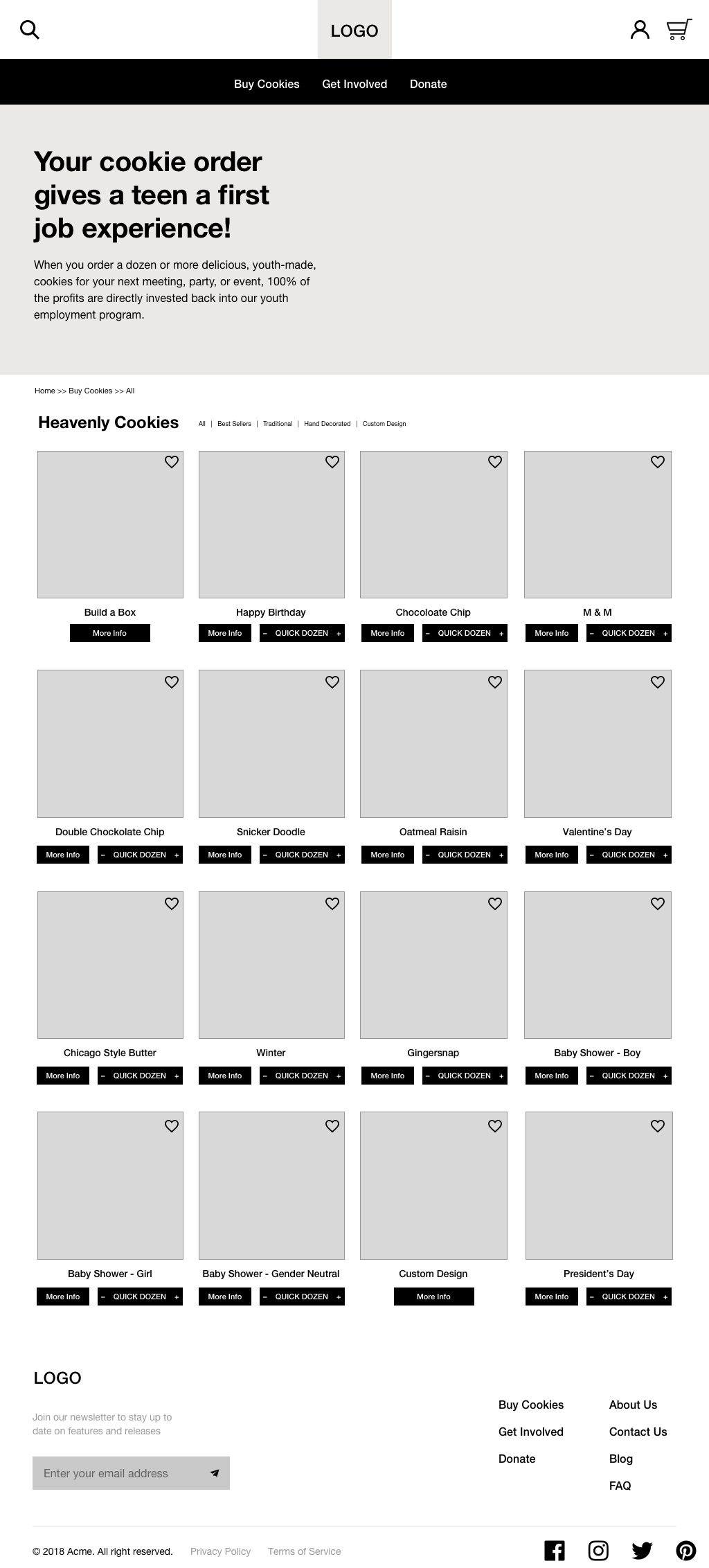
Product Page
Once a user selects the shop button they are brought to a page that lists all the items under that specific category. One of my user personas wanted an easy way to purchase, so I included a “quick dozen” button to most of the items.
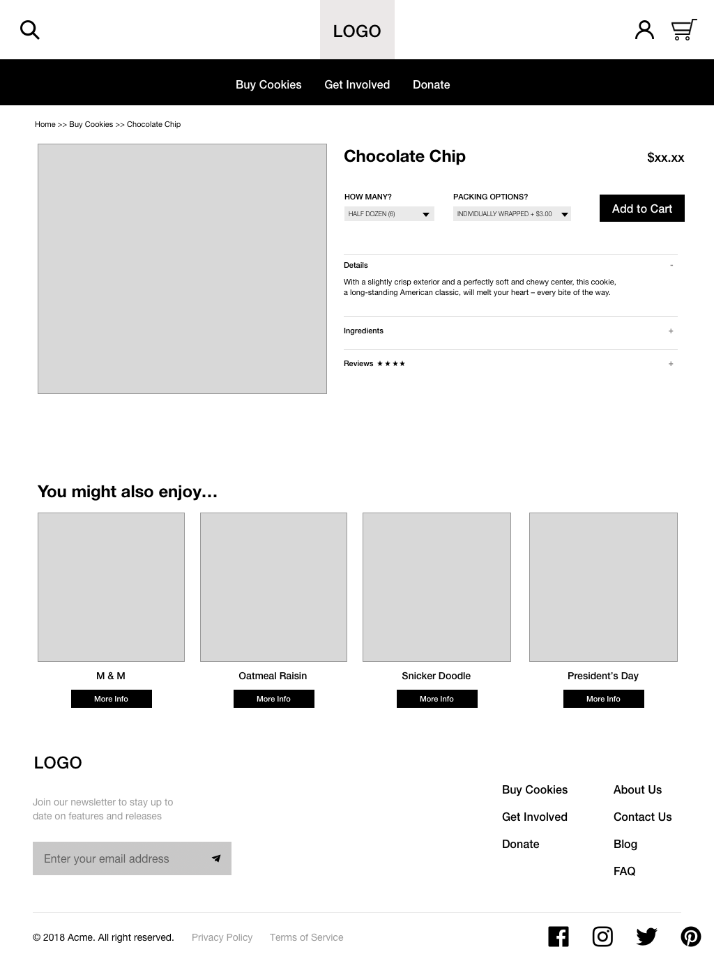
Single Product Page
On the single product page, I wanted to make sure to provide detailed product descriptions so that users can ensure the product fits their needs. Below a user could find helpful product recommendations based on the current product they’ve selected. I also gave priority to the product reviews section since this allows for user input, establishes trust and also allows users to make more informed buying decisions. To make the purchasing and packaging options as efficient as possible, I designed drop down menus that would list the options available for each item, and the price would automatically update depending on these options.
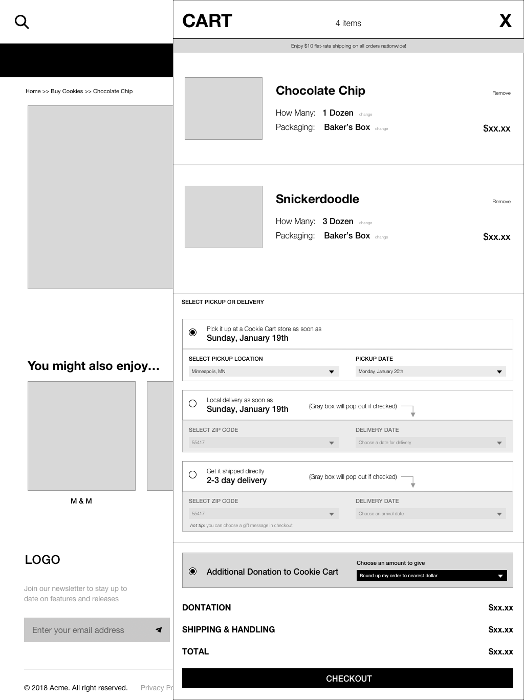
Cart Summary Page
Once the cart icon was selected, a user would be led to the cart summary page that would pop-out from icon. This was the first step in the checkout process where users could review and make changes to their cart as appropriate. I also included the option to select between in store pick and home delivery as a way to entice customers to visit Cookie Cart and lower shipping costs. There is also a button to give an additional donation to this non-profit with options to “round-up” or other dollar value amounts.
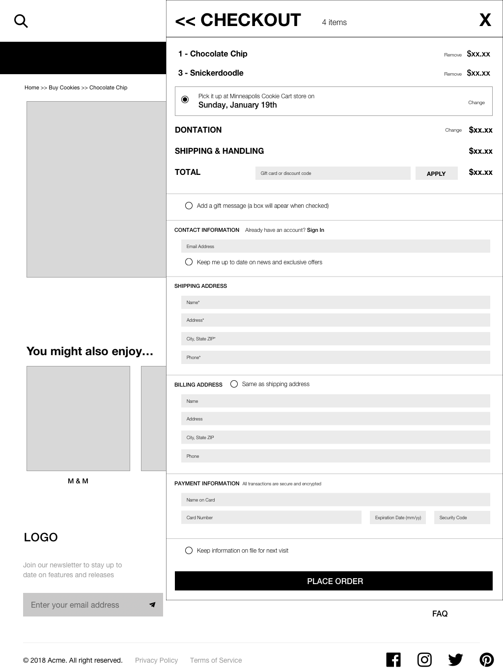
Checkout Page
One of the pain points I identified was having an efficient checkout process so I made sure to make this experience as seamless as possible. As a returning customer, users have the option to log in to their account and have their saved shipping and payment information auto filled in for them. I decided to keep the checkout process all on one page to make it easier for users to edit their information at any point in process.
Additional Screens
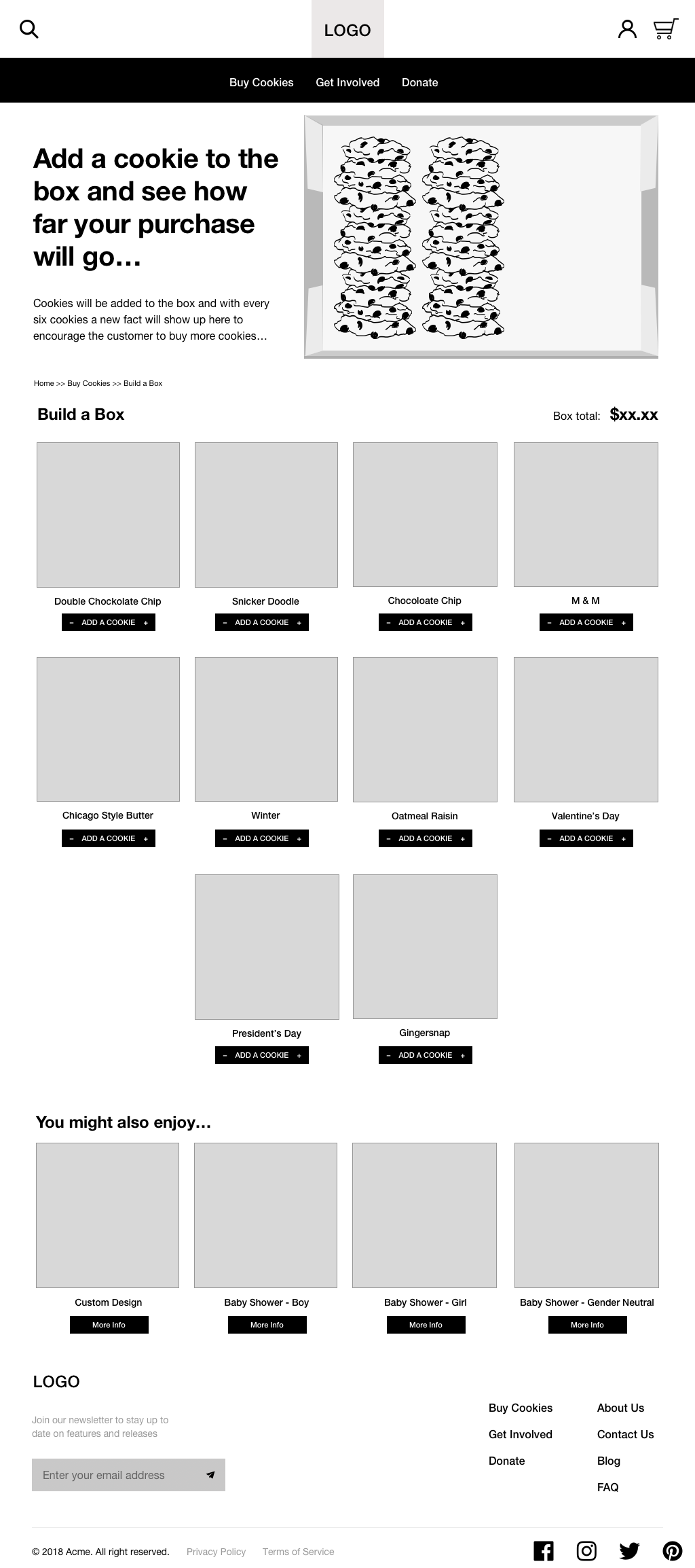
I also created some additional screens that included a Build-a-Box page, where customers can create their own unique box of cookies. This was created in response to the competitor research and after physically visiting the bakery to see how their business operates in-person.
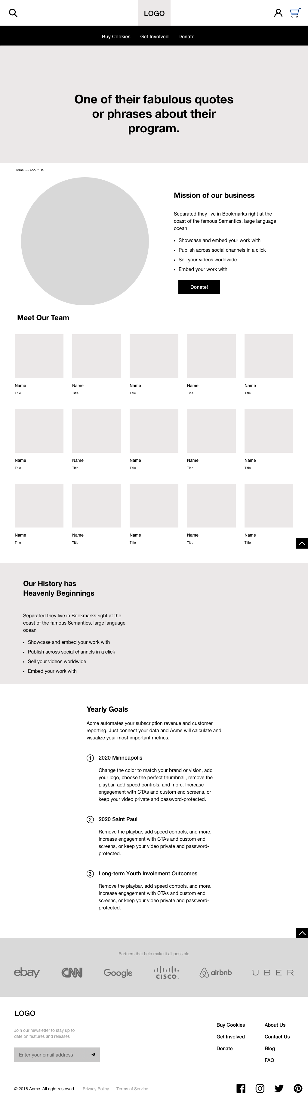
It was important that I included an About Page to emphasize what distinguishes Cookie Cart from other bakery websites. I also utilized this page as an opportunity to discuss in the unique 30 year long history of this local non-profit to reinforce their vision of supporting local urban teens. This page will also help create the connection to a mission oriented business, a value the personas were asking for.