Cookie Cart UX Case Study
Summary
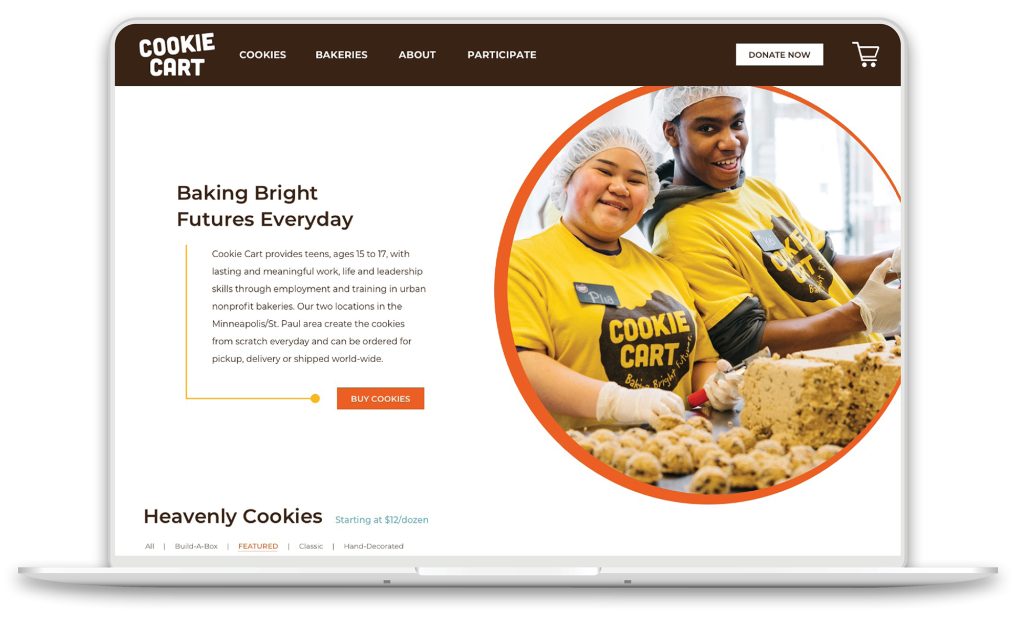
Design an on-brand, human-centered, e-commerce website, steeped in rich history with the ability to create a customer-mission connection. As a local non-profit bakery in the Twin Cities, Cookie Cart provides teens with lasting and meaningful work, along with life and leadership skills in urban bakery settings.
Problem
Re-design an existing, e-commerce website that will achieve the following goals:
• increase the sale of their cookies by 20% in the next 5 years
• create an easier cookie buying experience
• increase online donations
Solution
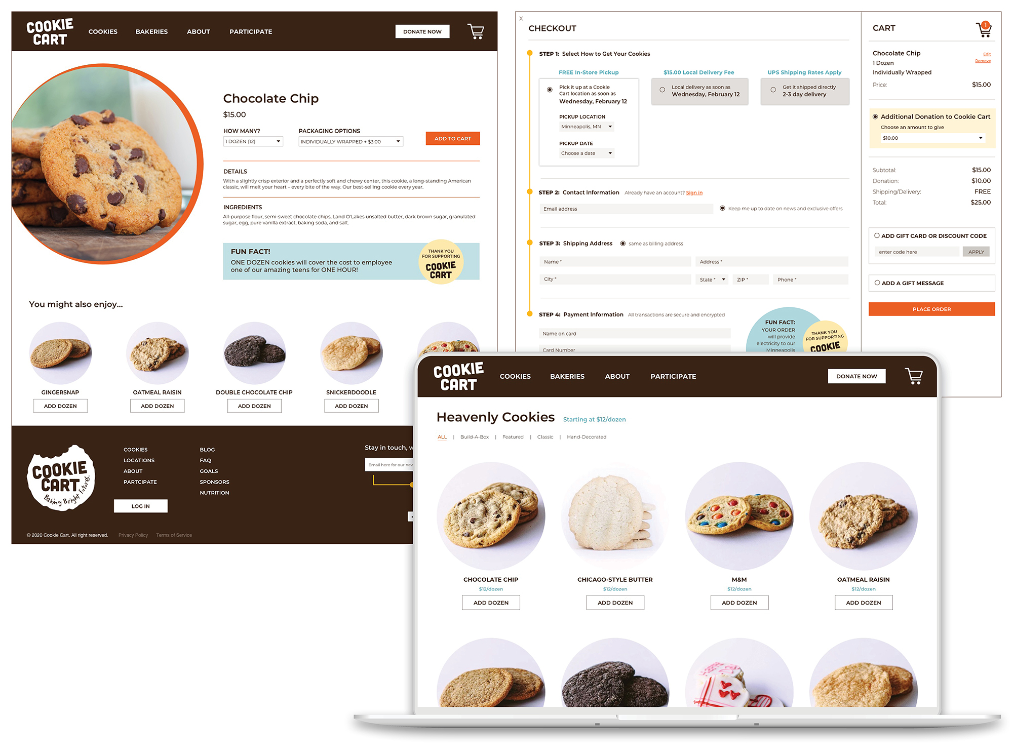
• Through informative, focused content, engaging photos and infographics, the entire website was re-imagined.
• Created an on-brand, user-friendly website, with clear call to actions.
• Designed an easy-to-understand solution for purchasing products.
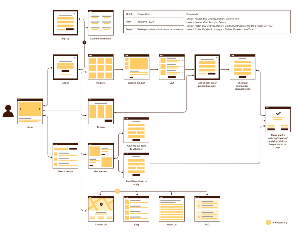
User Flows
After defining the “bigger picture” of the experiences, a user flow was created for the entire site. The point of this was to define the intended steps a user might take through various pages and actions on the website in order to complete their goal. This would allow focus on what the user needed to accomplish and deliver that experience in the most effective manner possible when designing site.
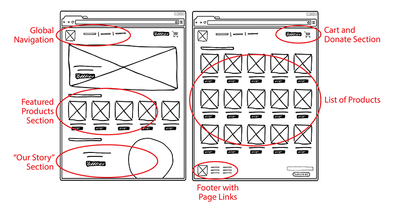
Sketching
To start the process of designing the site, a couple of the main screens were sketched, using the user flow as a guide.
Wireframes
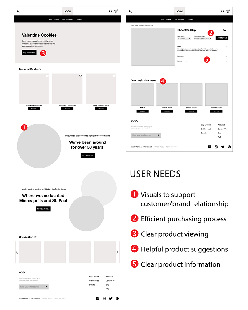
Using Sketch, the first wireframes were designed, making sure to prioritize the features that would best address the needs of the users throughout the website.
For more detail: View all the wireframes
High-fidelity Mockups
After feedback was implemented and improvements were made to the wireframes, high-fidelity mockups were designed in Sketch. After which, working prototypes were created in InVision to begin usability testing.
For more detail: Visit Cookie Cart Demo
Usability Testing
After interviewing six participants using the InVision prototype, key findings were:
• Overall the users thought the ‘Add Dozen’ button was very easy to use and intuitive. One commented that he’d never experienced a button like that, but it made complete sense how it worked.
• Initially the pickup, delivery, shipping options/wording was confusing for the first couple users, so after revising that section it had better success with subsequent users.
• A couple users are gluten-free wanted an easy way to find out about nutrition, so a quick link was added to the footer.
The Next Steps
This case study represents the start of a bigger design process for the development of this e-commerce website. The next steps would be to expand on the account pages, as initially this was something that was important to the client, but was put to the second phase during development. Also, to further iterate on the designs while continuing to emphasize these core values: youthful, nurturing, confident, and inspiring.
And a special THANKS to Cookie Cart for having a great mission, helping local teens and baking a yummy cookie! It was an honor to re-imagine your website.