Business Checking UX Case Study
Summary
A UX journey team is tasked with accurate page creation, validation, updates, and publishing of 500+ legacy pages into a global set of Adobe Experience Manager (AEM) components to achieve WCAG 2.1AA (A11Y) compliance across four business lines. This is how one page was updated to meet these guidelines.
Problem
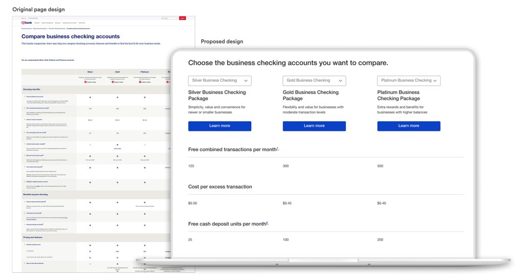
The “compare business checking accounts” legacy page used a layout that was not easily supported within the current set of global AEM components. The team needed to:
• Find a component that would support the information
• Naturally respond to a mobile layout
• Move the page into the new layout with minimal copy changes
• Receive business line approval
• Pass A11Y testing requirements
Solution
The content strategist, A11Y consultant and visual designer worked together to form a solution, that would also satisfy the needs of the business line, to move the “compare business checking accounts” page into global components. The page also responded in mobile with ease. Unfortunately, the published page did not meet WCAG 2.1AA compliance, but a plan was put in place to solve its A11Y outstanding issues.
My role
Research: As the visual designer, I explored several different global components in the UX repository. I read through their user guides and requirements to see if any could work as a possible solution. Secondly, I analyzed the page to see if the information on it could be organized in a different way while still staying true to its original context. I also researched how other companies were displaying similar information.
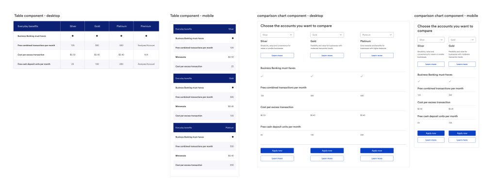
Wireframes: I tested out two different components in Figma. I also took a first pass at editing the page, then worked with the content strategist to refine the copy. We compared the two designs, how they both responded in mobile and shared them with our UX team at a daily stand-up.
High-fidelity Mockup: The entire page was designed in Figma with updated copy from the content strategist.
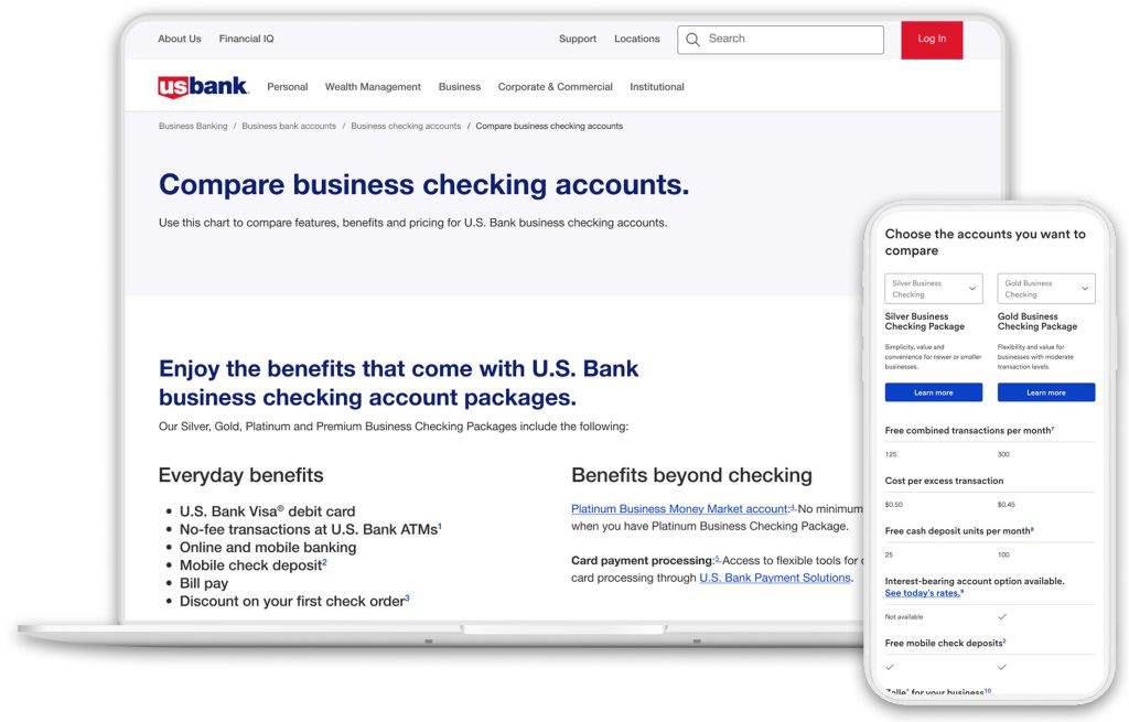
Final desktop design • Final mobile design
Usability Testing: After the page was built in AEM, our team participated in internal auditing and testing of the page. The user feedback brought forward that a few of the headings needed more explanation, so the content strategist reworked some copy to make it more consistent.
A11Y Testing: The page was heavily tested by our A11Y consultant, and many issues were documented. Several of the items, including consistent H-tags and aria labels for the checkmarks could be fixed by our AEM author, but others needed to be done by a dev team. I worked with our A11Y consultant to accurately document their recommended suggestions into a Jira story for the business line’s dev team to implement. I was involved in QA once the dev updates were deployed. At that time, I discovered that the table was not accessible on a Mac using VoiceOver screen reader. I recorded a video documenting my findings and compared it to a table that VoiceOver could read accurately. The dev team updated the component and addressed the A11Y issues to make the page WCAG 2.1AA (A11Y) compliant.
The Next Steps
Shortly after all of the A11Y issues were fixed, the business line redesigned the entire page. They also enhanced the component used for the comparison table in response to user feedback and business line objectives.