Accessibility UX Case Study
Summary
This case study will outline the actions that were taken to design a more inclusive pop-up calling window, and how user testing of icons and specific color combinations were integrated to determine the end results.
Problem
Re-imagine an existing pop-up incoming call window that will achieve the following goals:
• increase desired action on first attempt
• decrease undesired action on first attempt
• increase definition of icons
• increase visibility of icons
Solution
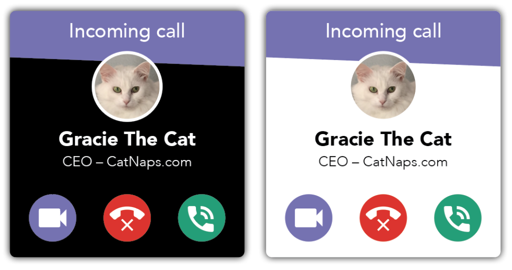
• Created an on-brand, user-friendly window, with clear call to actions.
• User testing information determined which icon design resulted in the correct action to be taken.
• Researched specific color combinations that more users could distinguish.
Research
Two main areas of research were taken for this update, icon design and color combinations.
While the original design uses standard Google icons, alone they do not adequately define what action is desired from each. Other possible icons styles were explored and two other designs were generated from this research.
The color combinations used for the original buttons do not enhance the desired action for each. Research emphasized that standard stop-go color combinations are challenging for color-blind individuals to distinguish the difference. Utilizing a color-blind simulator helped determine which color mixtures were most accessible.
Wireframes
Using InDesign, the first wireframes were designed, making sure to prioritize the features that would best address the needs of the users. These low-fidelity prototypes started in grayscale and limited color versions.
Usability Testing
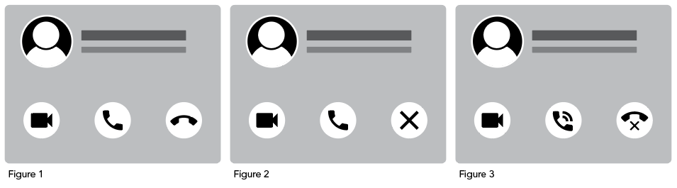
Testing was key to determine which icon best determined the correct call-to-action.
First goal: Figures 1, 2 and 3 were shown to users individually and in order. On each figure, the user was asked to “connect the phone call.” Figure 3 had the highest level of achievement, in the fastest time, with the least amount of contemplation.
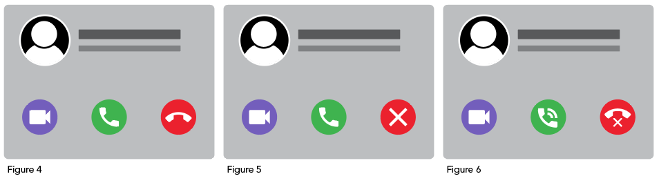
Second goal: Figures 4, 5 and 6 were shown to users individually and in order. On each figure, the user was asked to “decline the phone call.” With the addition of color, all users were able to complete the correct call-to-action. However, Figure 6 scored the easiest to determine, in the quickest time.
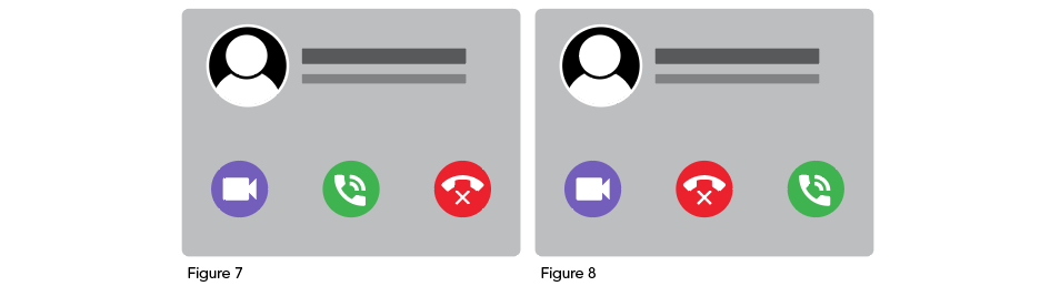
Third goal: Figures 7 and 8 were shown to users individually and in order. On each figure, the user was asked to “answer the call.” While all users were successful, half gravitated to figure 7 and half to figure 8. After discussing this more with the users, most said the order they picked more closely matched their phone’s caller window.
High-fidelity Mockups
After feedback was implemented and improvements were made to the wireframes, high-fidelity mockups were designed in InDesign.
Accessibility Testing
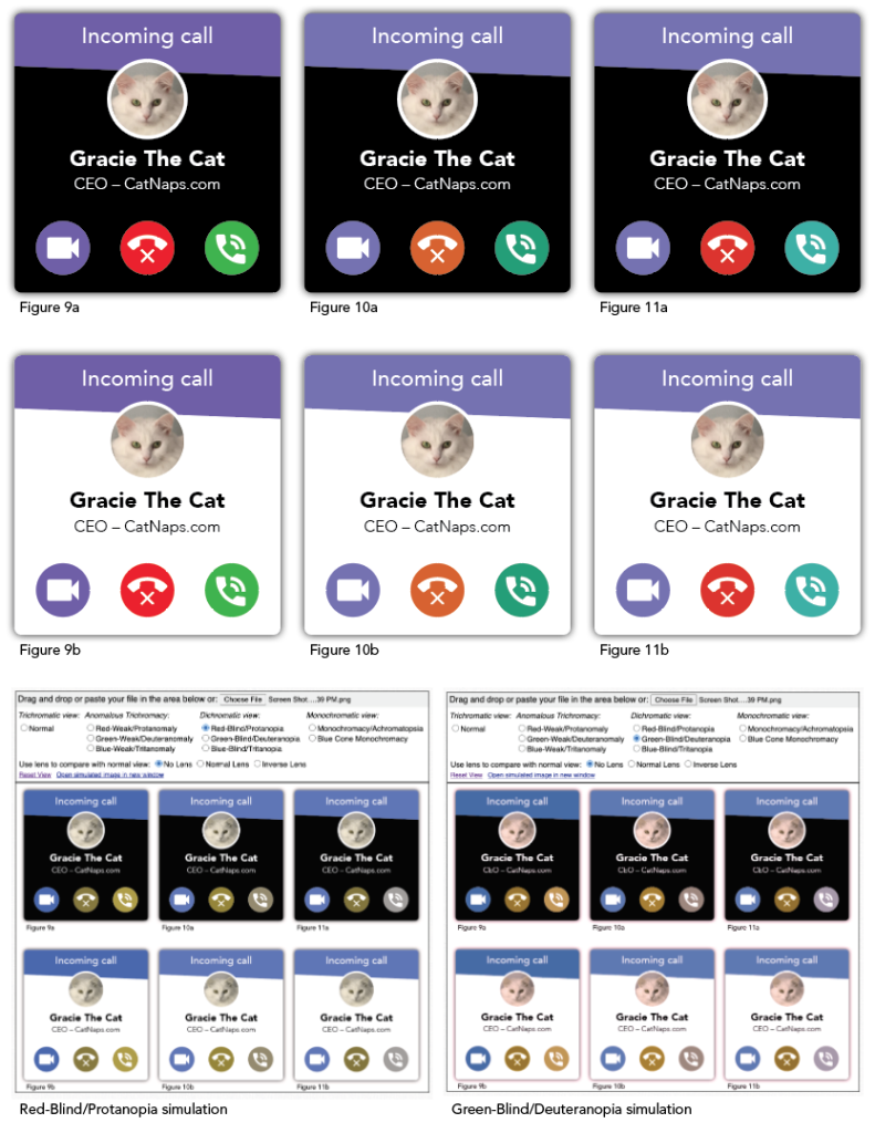
Various purple, red, green RGB values were tested using the Coblis Color Blindness Simulator. Figures 9a-11b represent three different potential combinations, along with their results in the simulator.
The Next Steps
While using the simulator has been extremely helpful up to this point, the next steps could involve user testing with color-blind individuals.
Lessons Learned
User testing was very helpful in determining the icon design. While the goal of icons is to be simple, they also need to be understandable. When used in combination with a button, the user needs to know what action to take with a quick glance. Slightly updating the icon generated a much more positive result.
It was eye-opening to be able to look through the lens of a color-blind individual using the Coblis simulator and how the slightest modification to RGB values could completely changed their appearance.
Special Thanks to These Resources:
• Google Icons
• Coblis — Color Blindness Simulator
• How to be color blind friendly Forum
• How to Use Color Blind Friendly Palettes to Make Your Charts Accessible
• Font Size on the Web
• 5 tips on designing colorblind-friendly visualizations
• Coloring for Colorblindness