Find My Food Truck UX Case Study
Summary
Design an on-brand, human-centered, food location services mobile website. There are two main tracks within this site, the food eater and the food truck owner. For the hungry person, the site will analyze the user’s current location (with permission) and display the accurate location of all food trucks in a half-mile radius of their location. For the food truck owners, they will be able to register the current location of their truck, along with times and menus. The owners will also be able to have this site automatically send notices to their Twitter, Facebook and Instagram accounts with a message about where their food truck is located.
Problem
Design a website that achieves the following goals:
• create one website that displays all food trucks in a specific location
• reduce the number of different sites a food truck owner would need to visit to advertise their location
• increase the number of patrons visiting a food truck
Solution
• Create an on-brand, user-friendly site, with clear call to actions.
• Design easy-to-understand solutions for different page-view opportunities.
• Incentivize truck owners by creating a one-stop place for them to post to numerous sites simultaneously.
User Flows
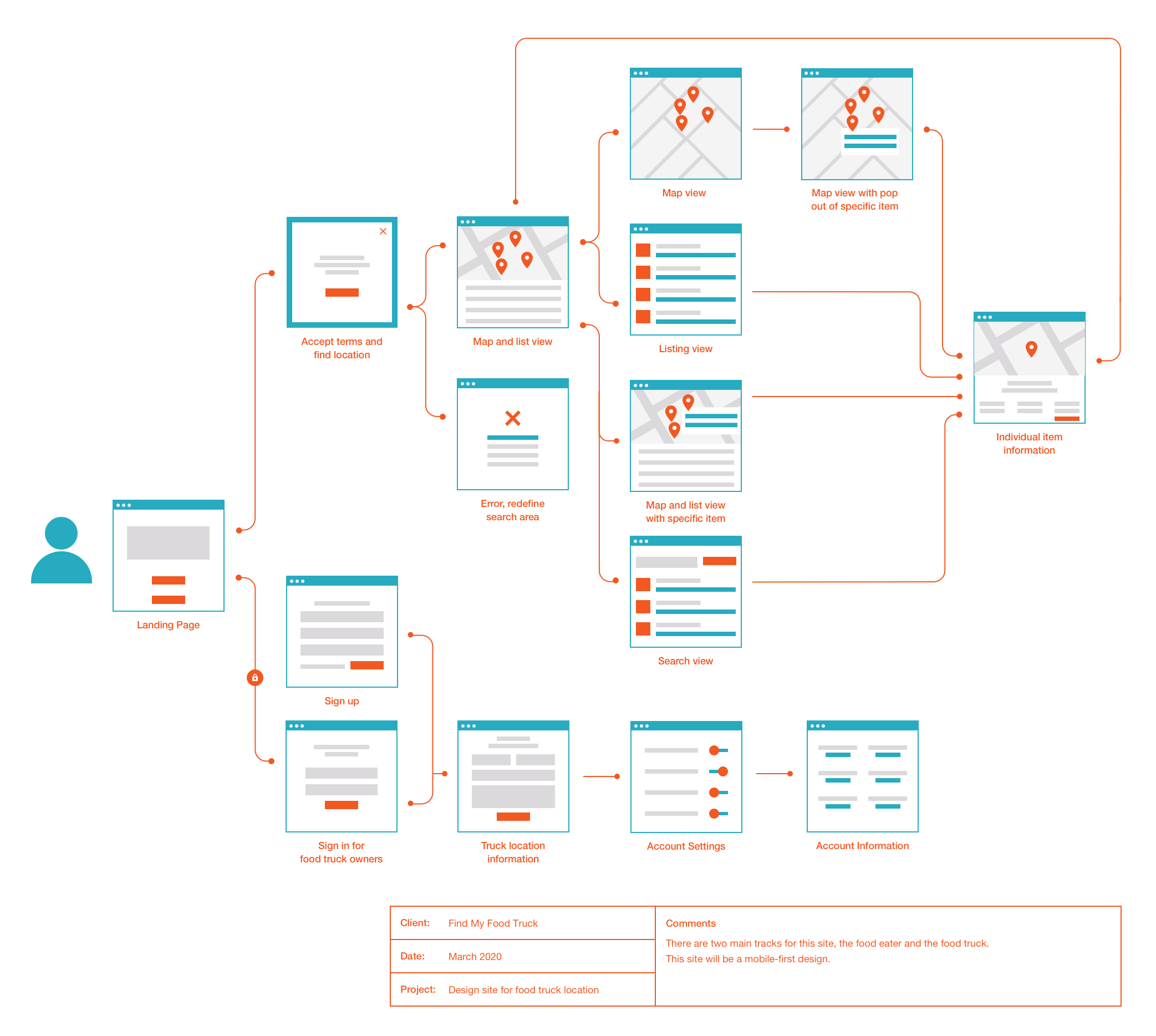
After researching and defining the overall view of the intended experiences, a user flow was created for the entire site in Sketch. The point of this was to define the steps a user might take through various pages and actions on the website in order to complete their goal. This would allow focus on what the user needed to accomplish and deliver that experience in the most effective manner possible when designing site.
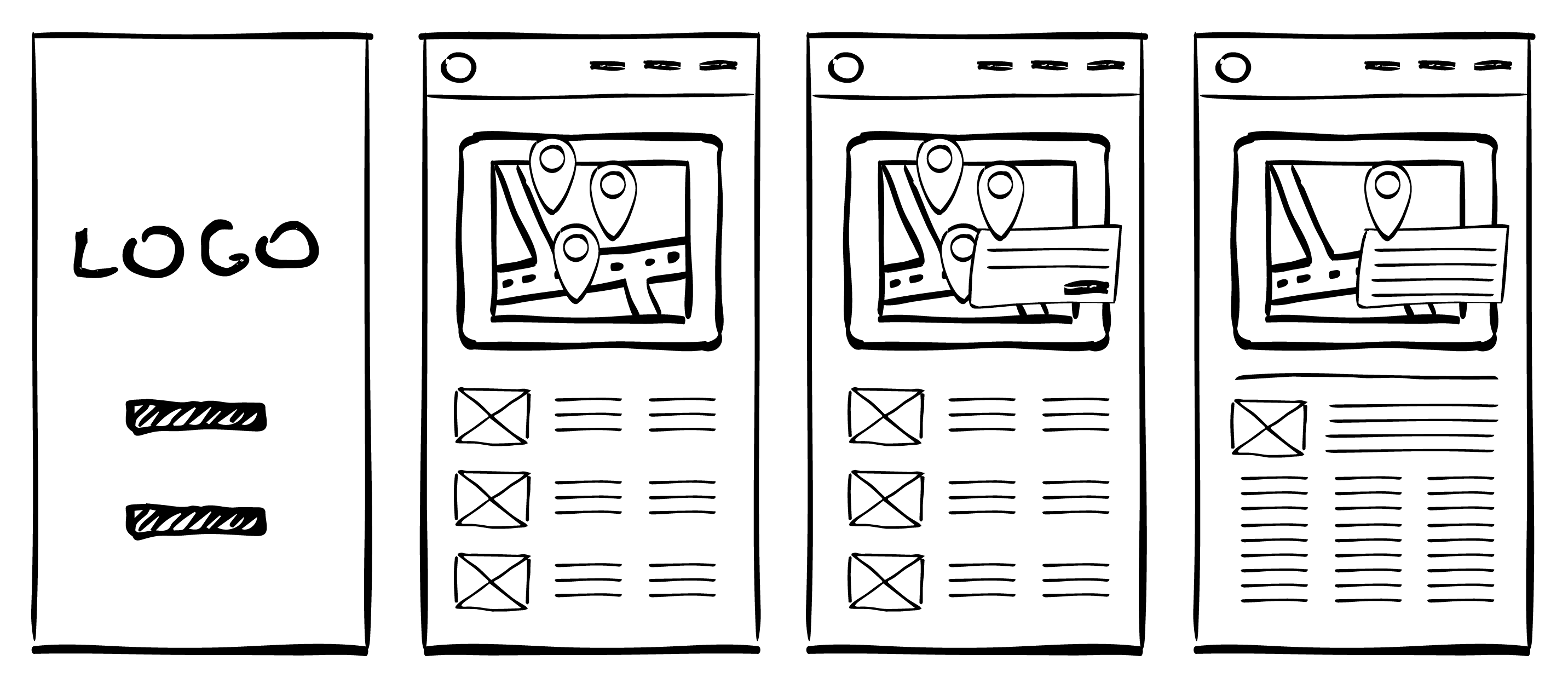
Sketching
To start the process of designing the site, a couple of the main screens were sketched, using the user flow as a guide.
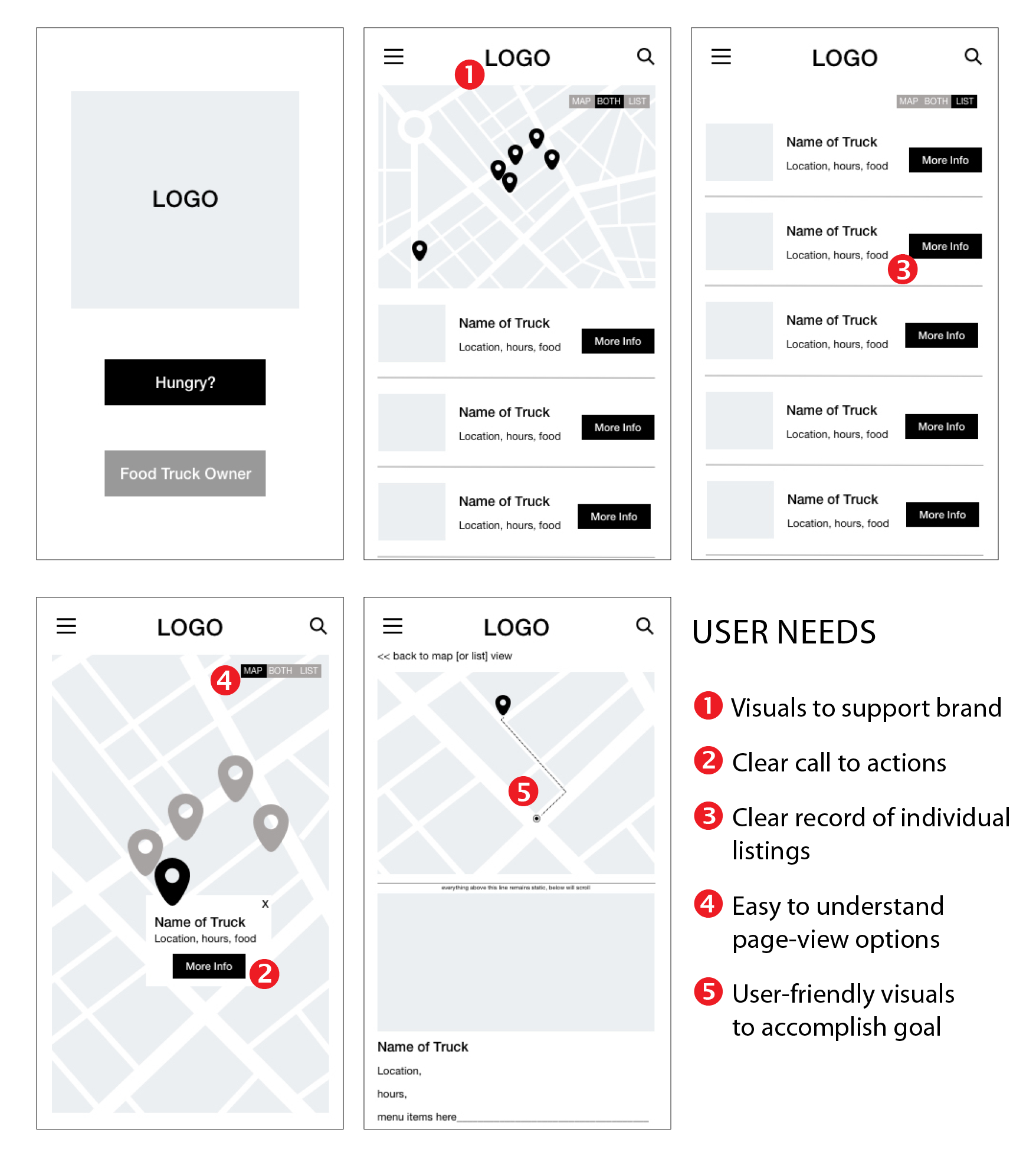
Wireframes
Using Sketch, the first wireframes were designed, making sure to prioritize the features that would best address the needs of the users throughout the website.
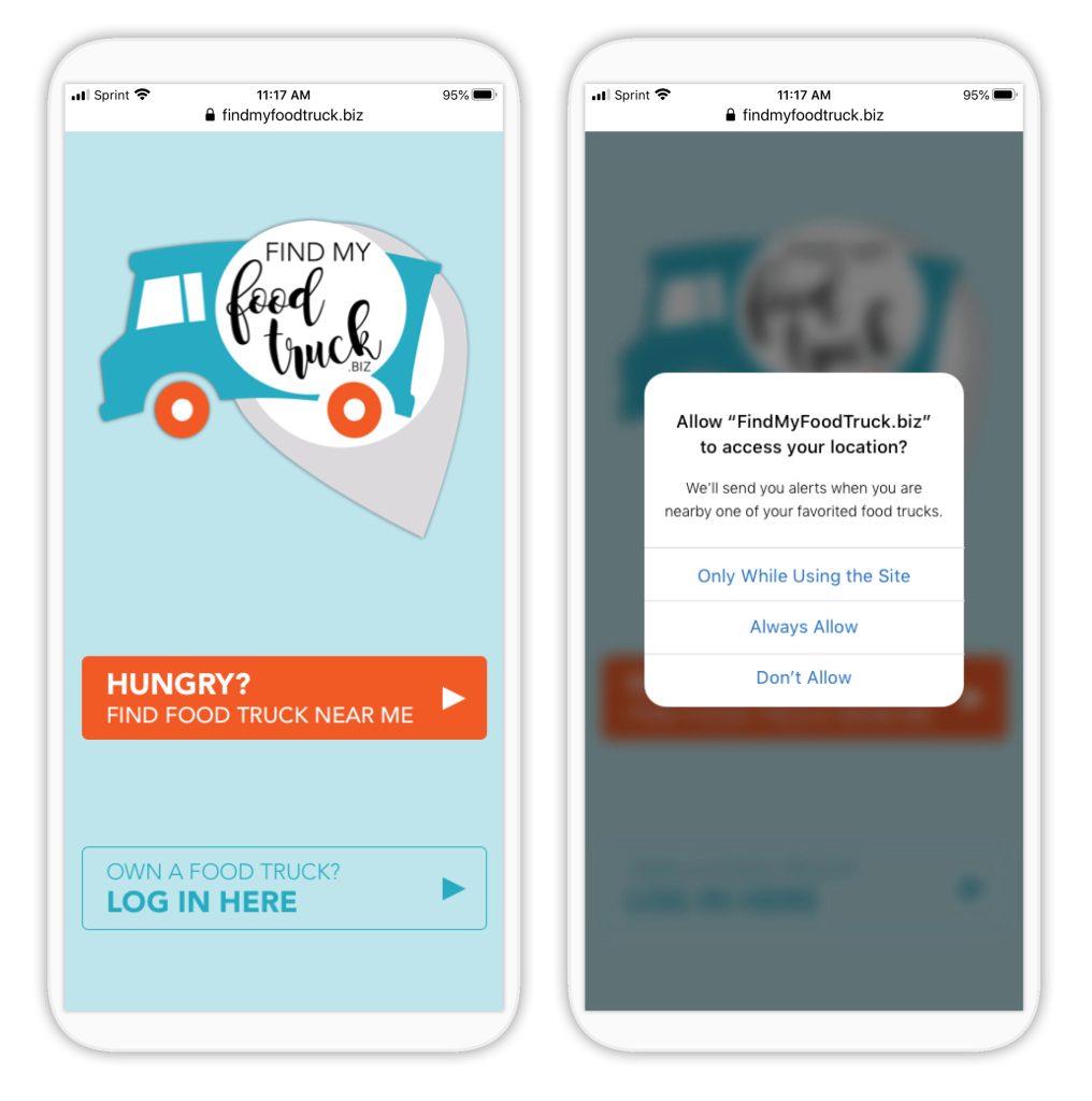
High-fidelity Mockups
After feedback was implemented and improvements were made to the wireframes, high-fidelity mockups were designed in Sketch. After which, a working prototypes was created to begin usability testing.
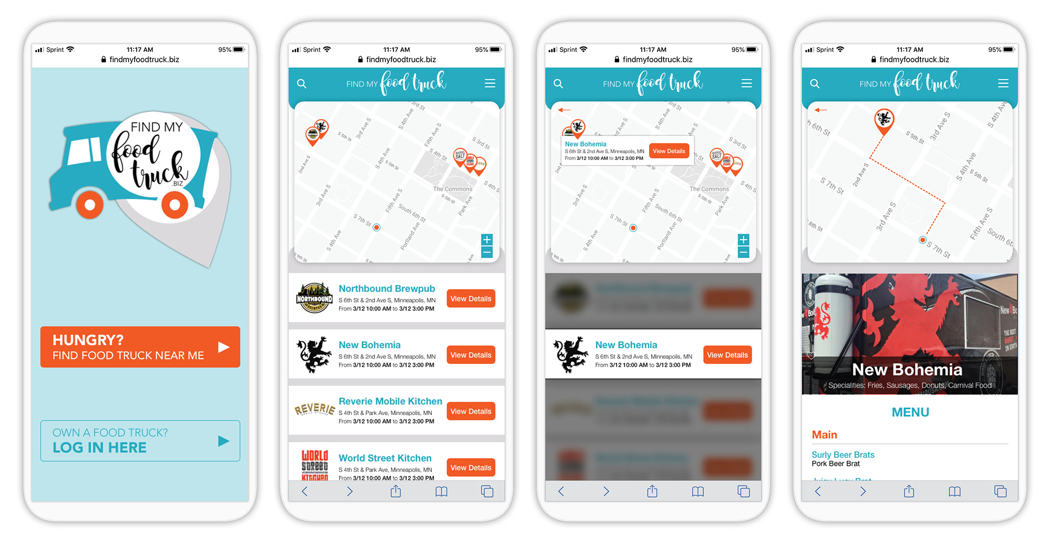
Usability Testing
The next step began with testing this prototype in-person with 5 users. There were three main actions asked for them to complete:
• On the landing page, can you choose the correct action for locating potential vehicles serving meals close by?
• While on the map page, can you tell me how many blocks you will need to walk to find the closest food truck?
• Are you able to find out more information about a specific food truck?
The overall consensus was that the site was easy to figure out, but that it was confusing to the user that the circle dot was the actual users location. When created for real-world application, the dot should be larger and be animated (blinking) to represent a common pattern that a user would expect.
Next Steps
This case study represents the start of a larger process for the design and development of this food location services website. The next steps would be to expand on the Food Truck owner track, as these iterations are an important layer for the client to take into production of site.